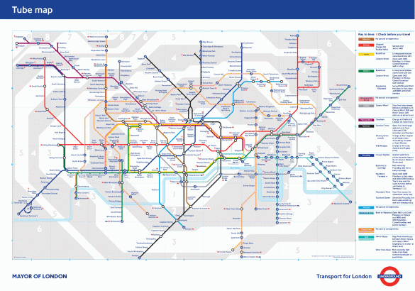
The London Underground Map has long been an example of fantastic graphic design and cartographic innovation; simplifying the complex labyrinth of the tube network and providing a straightforward representation of the many routes, connections and entry and exit points. This is a particularly powerful depiction given the map is only made-up of horizontal, vertical and 45º colour-coded lines. As some designers have pointed-out, it is more a diagram than a map, providing a visual representation of the connections underground, while not accurately depicting geographic proportions at street-level.
Whether map or diagram, it is a simple and simplifying representation of a complex subject. As is often the case, the power lies in its simplicity; and that simplicity masks the underlying complexity.
And so it is with strategy. The ‘best’ strategies, and the one’s most likely to be acted upon and realised, are the simple ones – those that speak to an unfulfilled need or unoccupied ‘space in the target consumers mind’; those that inherently embody a ‘call to action’ and mobilise all stakeholders in pursuit of an overarching purpose or meaning; those that touch an emotion or are inherently human-centred.
But, as with the Tube Map, developing, deploying and delivering these strategies requires us to work through the complexities to get to simplicity and be aware of the double-edged sword of how we communicate them – used as a frame of reference this type of map or diagram can be useful; used out of context, these simplifications can mislead us.
By way of illustration, let’s explore some of the characteristics of the Tube Map that might provoke some thought about how we craft and communicate business goals and strategies:
- Routes vs Destination – The Tube Map doesn’t prescribe a fixed destination, it provides a framework of possible routes. Too many ‘strategies’ try to describe the ‘fixed destination’, usually defined by a set of standard financial dimensions and supported by an anal retentive amount of analysis plotting the specifics of a step-by-step journey. Not only is this degree of prediction impossible with any accuracy, more importantly it closes off the many alternative routes that could be taken along the way. While developing strategy requires us to distil our overarching purpose and fundamental boundaries of where we will, and will not, go, over-prescribing the journey will constrain an organisation’s creativity and limit choices along the way.
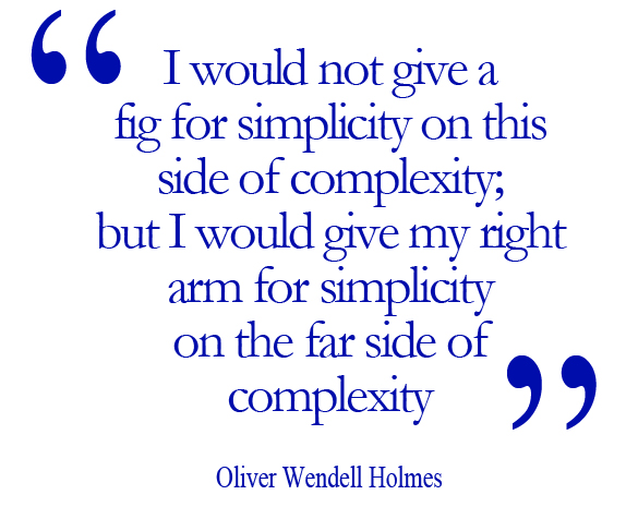
- From Complexity to Simplicity – The Tube Map is definitely a simple, and simplifying, representation of a complex system. Similarly, while ‘simple’ strategies are extremely powerful, most ‘simple’ winning strategies are only simple in hindsight; while obvious in retrospect they don’t always appear this way at the start of their life. If they did, everyone would have seen them and been pursuing them. Arriving at any breakthrough, and making it appear simple, is a messy and iterative process of divergent and convergent conversations, gleaning insights, testing hypotheses and finding the unique angle that others haven’t spotted. While, in the words of Oliver Wendell Holmes, we should be striving to get to the ‘simplicity on the far side of complexity’, it’s dangerous to try to jump there too soon. In the desire to ‘Keep It Simple Stupid’, many companies end-up with a simplistic answer to a complex question, usually wrapped-up in meaningless cliché’s and tag-lines that look like they’ve been taken from cheesy motivational posters.
- The Hands of a Few and the Hands of the Many – Conceiving, constructing and operating a system as complex as the Tube could not be undertaken by one ‘mastermind’. Equally, distilling the complexities of the Tube system, and particularly coming-up with such a powerful way of communicating it to the masses, could not be done by committee or trying to simply ‘amalgamate the sum of the parts’. This balance of managing the complexities between the ‘hands of the few’ and the ‘hands of the many’ epitomises the balancing act of the conversations that make-up an effective strategic dialogue. We need the perspectives, insights and expertise of many different players to understand all of the moving parts and how they interact. Each of these players then require their own ‘map’ of how to navigate the system from their perspective – imagine the variations of wiring diagrams, plumbing schematics, infrastructure designs, engineering layouts and so on that it takes to describe the details of the Tube system. And when we come to communicating this to ‘the masses’ or the ‘users’ of the system, then we need to provide a simple and simplifying way of navigating the system.
- Understand the Limitations of How You Communicate It – While the Tube Map succinctly and clearly shows the lines and connections that make-up the entire London Underground system, it does not include every detail and is not even ‘geographically correct’ – it sacrifices some perspectives if favour of others. Strategies are meant to provide meaning, direction and boundaries to shape operational choices and activities, providing people with ‘enough’ to allow them to make informed decisions about their day-to-day actions. As such, they are not intended to prescribe everything in precise detail. Similarly, as we communicate strategy through our organisations we need to understand the perspectives we are emphasising in the way we communicate – for example, the space in the consumers mind that we want to own, the customer experience we are creating, the meaning of our brand, the value proposition we will live up to, to name a few. Whichever perspective we use as the overarching communication, we need to supplement this with the other ‘lenses’ specific stakeholder groups will require to understand there piece of the ‘system’ and provide the context so people know how to use the map to navigate.
- It’s Not Definitive; But It’s Useful – While the Tube Map does not, and could not, describe every detail of the London Underground system, it is an extremely powerful and useful aid to anyone trying to navigate their way across the city by train – to help see where you are and where you are going. Equally, no strategy, or the communication that accompanies it, can precisely predict every twist and turn of the journey or prescribe for every eventuality. The essence must be providing a context, an overriding direction, and a framework for helping people to make the choices that will keep us on track to our objectives. A useful strategy helps people to connect both the means and the end, both the cause and effect, both the actions and the outcomes.
- Both Time-tested Principles and the Recognition of a New Context – The simplicity of the Tube Map has stood the test of time, having first been designed by Harry Beck in 1931 while working as an engineering draftsman in the London Underground Signals Office. Beck had the insight that passengers were more interested in how to get from one station to another and where to change, rather than the geographic accuracy of the map. Replacing the assumption of geographic accuracy with the principles of electrical wiring diagrams, he created the basis of the map we know today – 90º and 45º angles, colour-coded lines, equi-spaced stations. But like most breakthrough ideas, it wasn’t accepted immediately. Being considered ‘too radical’ it wasn’t published until 1933. The latest twist in this story is the recasting of the map in the current digital age. While many of the fundamental principles of the map are still absolutely relevant, the recognition that more passengers are viewing the map on mobile devices has led to the development of condensed typefaces that are easier to view on small screens. And this month Transport for London has issued an API (Application Programming Interface) allowing programmers to send two geographical points to the API, and it’ll send back the most efficient way of getting from A to B using public transport in London, paving the way for many more interactive applications of the map. This evolving story over 80 years holds many parallels for strategy – insights are the start-point for new opportunities; bringing ideas, principles and learnings from other fields triggers innovation; breakthrough ideas are not always immediately embraced or welcomed; and all strategies need to respect the Law of Change, in this example adapting to a digital era and ‘always on’ culture.
Running through these few thought-provokers is a common theme: The ‘map is not the terrain’. It’s vital to respect that no strategy can live ‘on paper’ (or even worse, in PowerPoint!), it’s the interaction between the map and the terrain that brings it to life, tests it in real-time and provides the constant feedback loop that keeps it real, fresh and relevant. Even armed with the Tube Map, the best way to find your way around London is to get out there! The artificial separation of ‘strategy development’ and ‘strategy execution’ is a typical pitfall founded on the belief that a small group of ‘masterminds’ can determine the route and the rest of the organisation just needs to march along it. We live in a fast-changing, increasingly unpredictable world and the dimensions of strategy development, deployment and delivery need to become much more overlapping and intertwined.
The iconic design of a means of navigating one of the world’s busiest transport systems may not be an obvious parallel for strategy development, deployment and delivery. But understanding how to create simplicity out of complexity, show critical connections, routes and boundaries, and provide unifying means of communicating ‘the system’ we operate in are powerful lessons. Lessons that underline an increasing trend of bringing design thinking and strategic thinking together.
What does your map look like?
–
London Underground Map © Transport for London


